Type families fall into measurable categories that determine voice and function. Serif faces such as Times New Roman and Georgia anchor long reading blocks; slab serif works well for editorial headlines and product labeling. Sans serif families break into grotesque, humanist and geometric forms; Roboto (released by Google in 2011) and Open Sans (2011) are widely used for UI. Display and decorative faces are intended for short, memorable treatments. Knowing these categories enables intentional choices that align with brand tone.
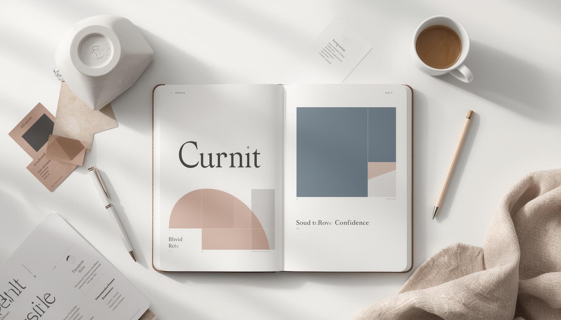
Core Principles of Pairing
Successful combinations balance contrast and harmony. Contrast can come from x-height, stroke contrast, or the presence or absence of serifs. Harmony is achieved when shared proportions or historical lineage link the faces. Priority goes to functionality: a headline must attract, body text must sustain reading. Use font combinations that support information flow and brand personality.
Hierarchy and Contrast

Hierarchy directs attention using size, weight and color. Establish a clear scale with three levels at minimum: primary headline, secondary headline or subhead, and body. Contrast may use weight differences only; avoid relying on extreme tracking shifts that hurt legibility. A consistent rhythm across pages strengthens recognition and navigation.
Fonts by Mood and Tone
Fonts convey specific moods. For example, humanist sans serifs often read as friendly and accessible, making them suitable for healthcare or education brands. Geometric sans convey modern tech associations. Transitional serifs feel authoritative. Match mood to audience: a financial firm may prefer classical serifs paired with a neutral grotesque for UI, while a craft brand benefits from warm slab serifs and handmade script accents.
Pairing Serif and Sans Serif Effectively
Start by selecting a functional face for long copy, then choose a complementary face for headlines or UI. Avoid pairing two faces with the same contrast and proportion, which creates visual noise. Below is a practical comparison of common pairings with rationale and recommended use cases.
| Role | Serif example (year, designer or foundry) | Sans example (year, designer or foundry) | Pairing rationale and primary use |
|---|---|---|---|
| Corporate reporting | Georgia (1993, Matthew Carter) | Roboto (2011, Christian Robertson) | Georgia offers classic readability in print and PDF, Roboto delivers neutral UI balance for dashboards |
| Editorial and longform | Merriweather (2010, Eben Sorkin) | Open Sans (2011, Steve Matteson) | Merriweather's robust strokes suit headlines, Open Sans maintains clarity in web body |
| Luxury branding | Playfair Display (2011, Claus Eggers Sørensen) | Lato (2010, Łukasz Dziedzic) | High contrast in Playfair with modern Lato gives elegance without old fashioned feel |
| Startup product | Source Serif Pro (2017, Frank Grießhammer) | Source Sans Pro (2012, Paul D. Hunt) | Shared lineage ensures cohesion across UI and marketing assets |
Follow above examples by testing actual content to confirm rhythm and color interactions.
Script, Display and Decorative Fonts
Scripts and ornate faces function as accents. Use them sparingly for logos, callouts and promotional headers. Limit script usage to single words or short phrases. Decorative faces should never replace a reliable body type, because decorative shapes break down at small sizes and on low resolution screens.
Font Superfamilies for Cohesion
Superfamilies such as IBM Plex, Source family, and Inter + Inter UI provide multiple weights and optical sizes across serif, sans and mono variants. These systems reduce mismatch risk and speed workflow, particularly for large brands that require multilingual support and many applications.
Weight, Size and Letterspacing
Weight and size interact with letterspacing. Heavier weights often need tighter tracking to avoid appearing bulky. Increase tracking slightly for uppercase headlines to improve legibility. For small UI text, prioritize weight over increased size to preserve layout balance on mobile screens.
Color, Texture and Background
Typeface color contrast must meet accessibility thresholds. WCAG 2.1 requires a minimum contrast ratio of 4.5:1 for normal text and 3:1 for large text. Text over textured or photographed backgrounds benefits from subtle overlays or solid color blocks to maintain legibility without losing visual interest.
Readability Legibility and Accessibility
Legibility focuses on letter shapes, readability on whole paragraphs. Choose a face with open counters and consistent stroke endings for long reading. Use font-size scaling based on device and audience age. For public sector and healthcare deliverables, select faces known for clarity and consider user testing with representative participants.
Responsive Typography for Devices and Screens
Implement a modular scale for responsive sizes, for example a 1.25 ratio with base sizes 16, 20, 25, 31.25 pixels. Use CSS font features such as font-display swap and prefer variable fonts where available to reduce layout shifts and deliver consistent appearance across breakpoints.
Web Performance and Font Loading
Font file optimization saves kilobytes and improves speed. Serve only required character sets and weights. Variable fonts can replace multiple static files and reduce total payload. Configure caching and use modern formats like WOFF2; on average WOFF2 reduces file size by 30 to 50 percent compared with legacy formats.
Licensing Commercial Use and Attribution
Verify licensing before embedding fonts. Google Fonts offers open licenses, but many foundries require separate desktop, web and app licenses. For example, a commercial web license from Adobe Fonts is bundled in Creative Cloud, while independent foundries such as Hoefler&Co require direct purchase. Always document vendor, license type, and permitted uses.
Tools and Resources for Font Pairs
Use font catalogs and visual comparison tools to preview pairings on real content. Many design systems include curated pairings and specimen pages that speed decision making. Maintain a local reference with example headlines, buttons and microcopy to evaluate rhythm.
Workflow From Moodboard to Final Selection
Translate brand moodboards into practical constraints: primary font family, UI family, accents, and legal obligations. Build a prototype that shows the type in hierarchy across pages and states. Establish tokenized scales for sizes and spacings to hand off to developers.
Testing and Iterating Combinations
Conduct A B tests and qualitative reviews. Gather reading speed metrics for long copy and click rates for CTA treatments. Iterate based on data and maintain a changelog of typographic decisions.
Real World Case Studies and Before and After Examples
Document two or three project outcomes showing measurable improvements. Examples could include increased dwell time after switching to a more readable type system, or reduced bounce rates when contrast and scale were optimized. Record dates and metrics to support future proposals.
Common Pairing Mistakes to Avoid
Avoid combining two display faces, forcing a decorative face into body text, and neglecting license terms. Over reliance on subtle differences between two very similar grotesques leads to weak hierarchy and inconsistent tone.
Building a Scalable Brand Typeface System
Create tokens for primary, secondary and accent families, sizes and weights. Include fallback fonts for performance and locale specific alternates. A scalable system reduces arbitrary choices and supports global rollout.
Presenting and Justifying Font Choices to Clients

Frame decisions around brand goals, user needs and measurable outcomes. Provide visual examples, accessibility checks and license summaries. Offer a migration plan and the expected impact on production timelines and costs.